(003) — Direction A · Counsel-led
The Counsel
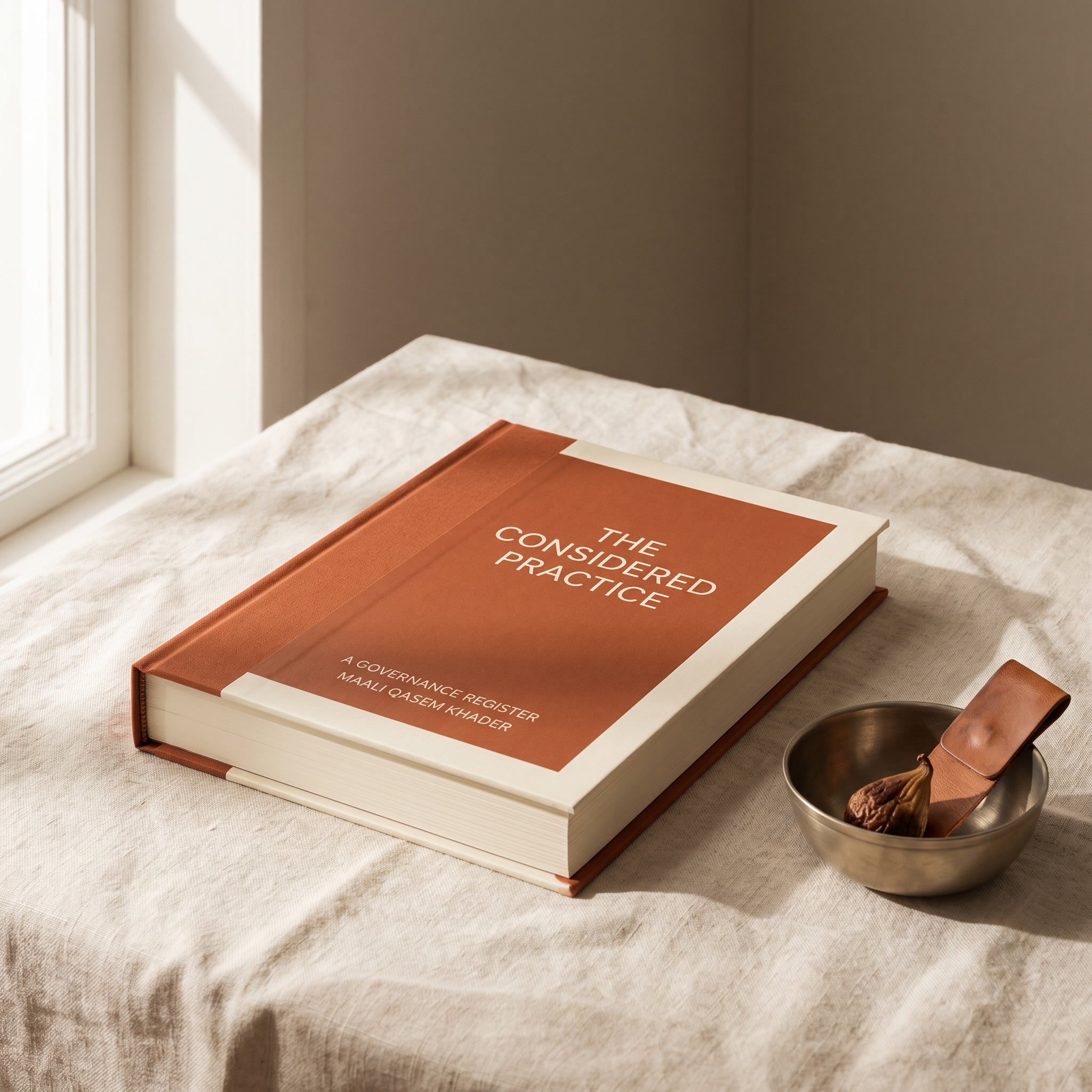
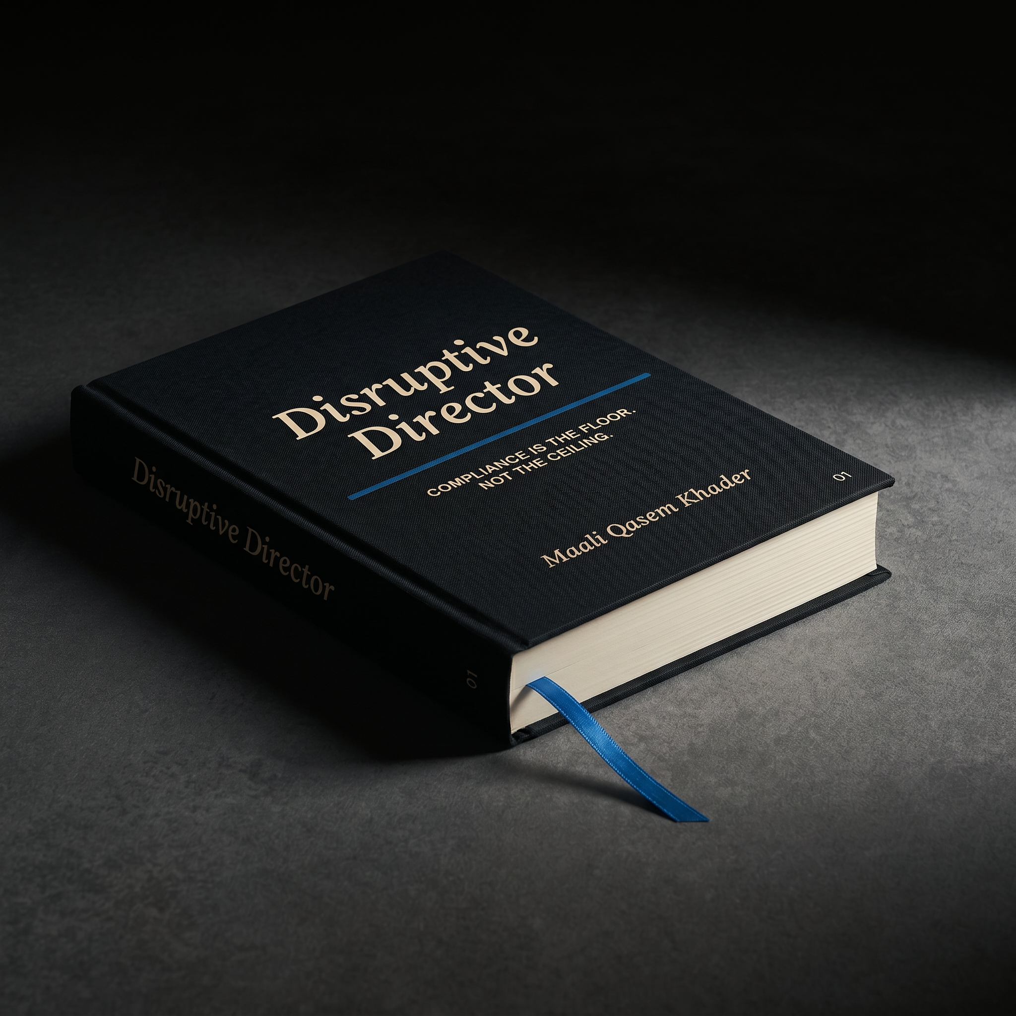
A Counsel brand earns trust through institutional precision without institutional sameness. Disruptive Director as the serious publisher of governance practice. Oxblood replaces navy. Bone replaces cream. The register shifts from financial-institution to legal-press — closer to a Yale University Press jacket than a bank annual report.
Best fit if Maali wants the Counsel register that earns the first board meeting through what's printed on the cover, not who's standing on a stage.
01 Typography specimen
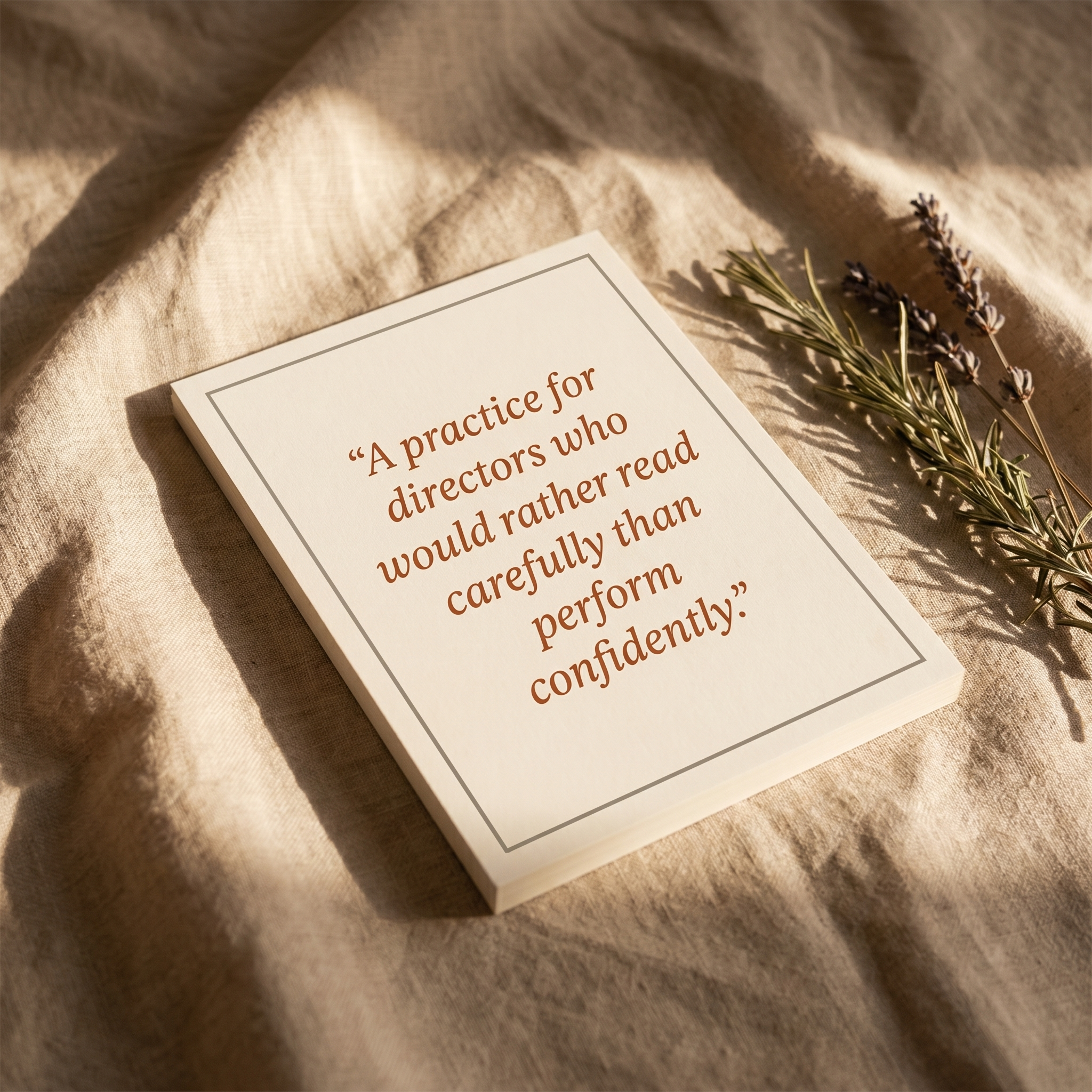
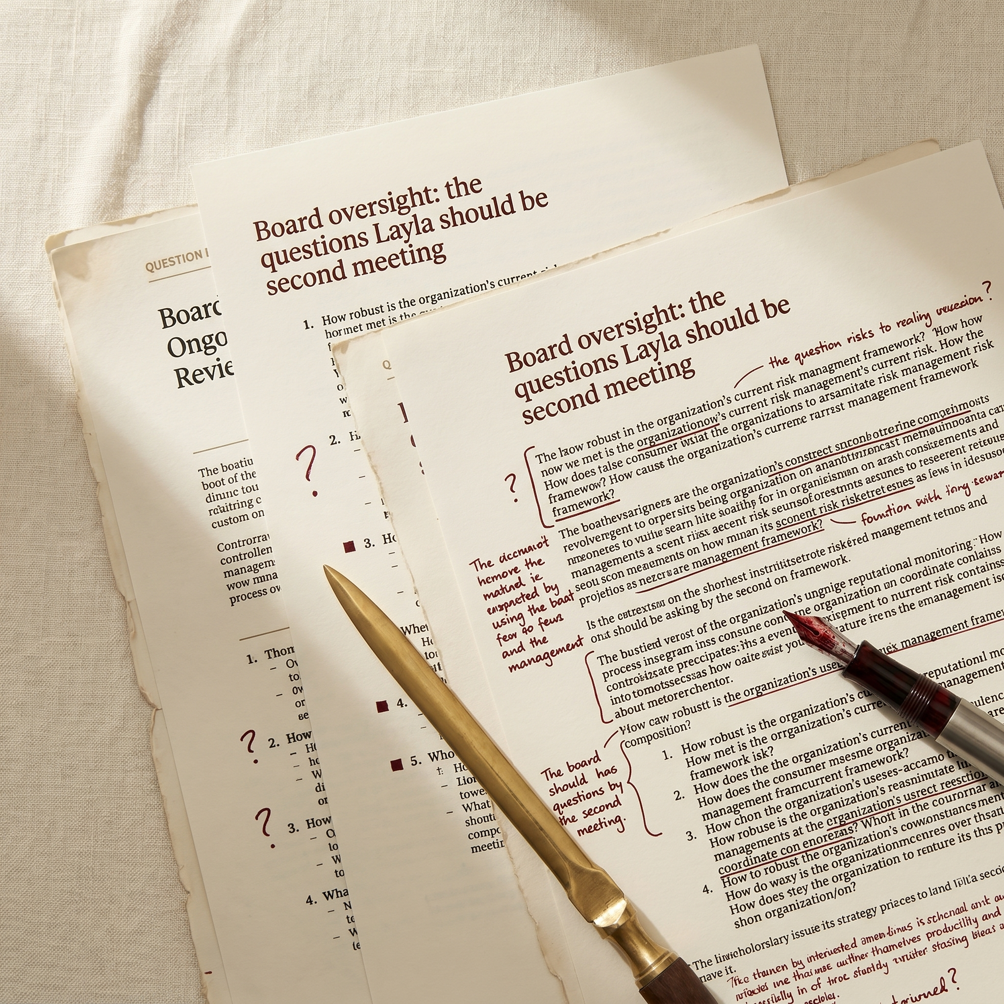
Better questions, on the record.
The Counsel typography reads like a serious publishing imprint, not a corporate brochure. Newsreader is a contemporary text serif drawn for long reading at small sizes — closer to FT Weekend or HBR than to a financial annual report. Inter underneath is the modern operator sans, refined enough to carry tabular data, footnotes, and case-citation style without visual noise. The combination reads as edited, not designed.
A.C.T.I.V.E. · 380M · 41M
02 Color system
03 Voice samples
Homepage hero
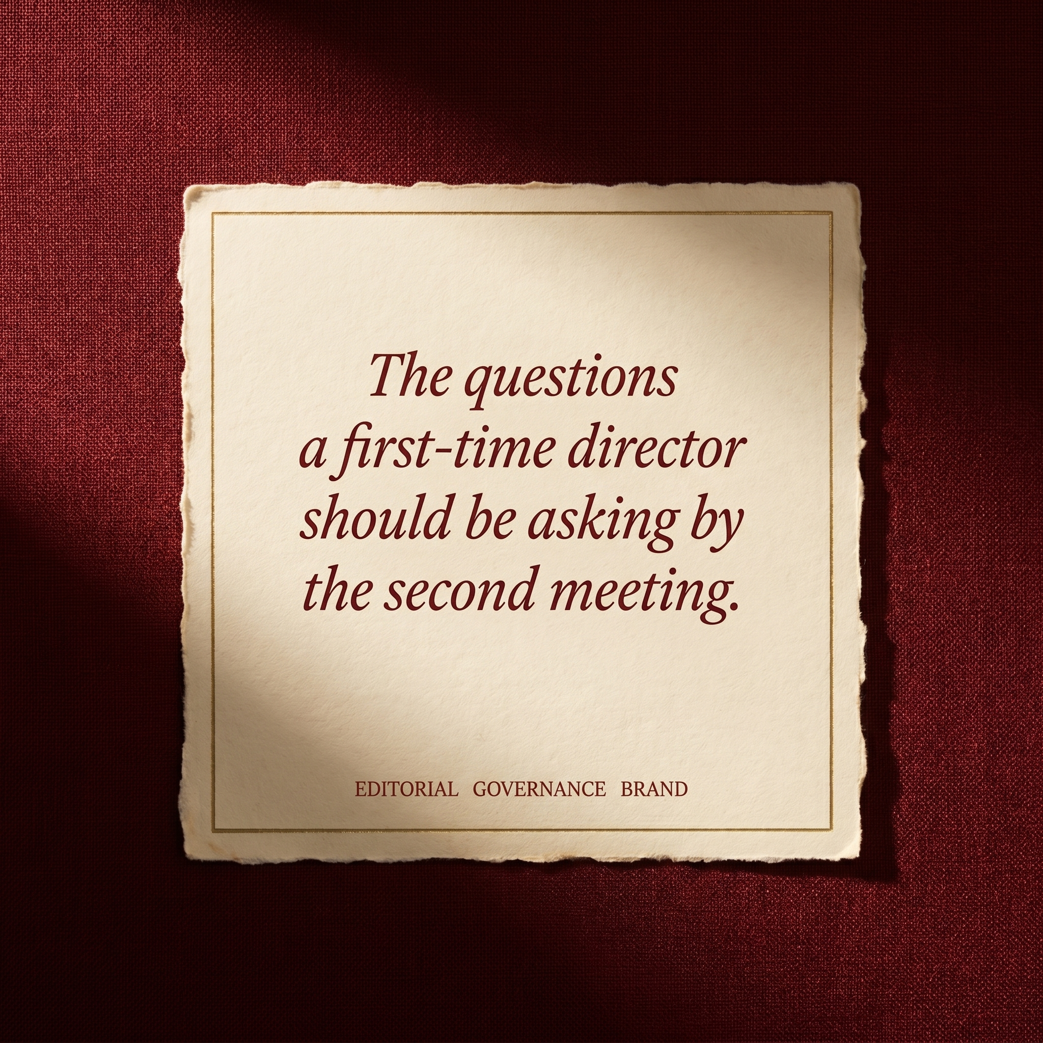
The questions a first-time director should be asking by the second meeting. And the ones most boards stop asking by the second year.
Email subject line
A field note on board oversight, from a regulator who has read both sides of the agreement.
LinkedIn post open
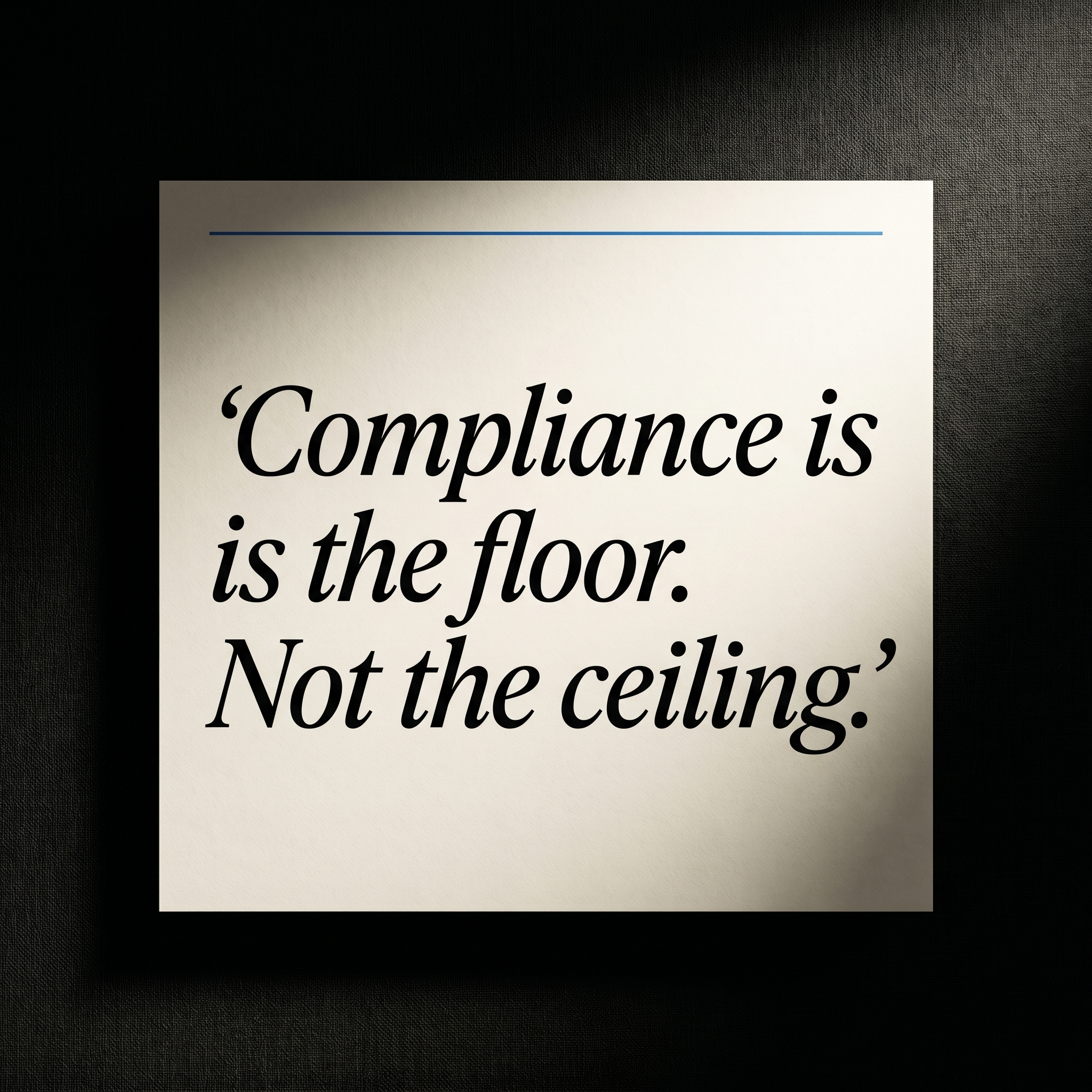
A pattern that recurs across nearly every governance failure I've reviewed in the GCC. Worth naming carefully.
04 Photography direction
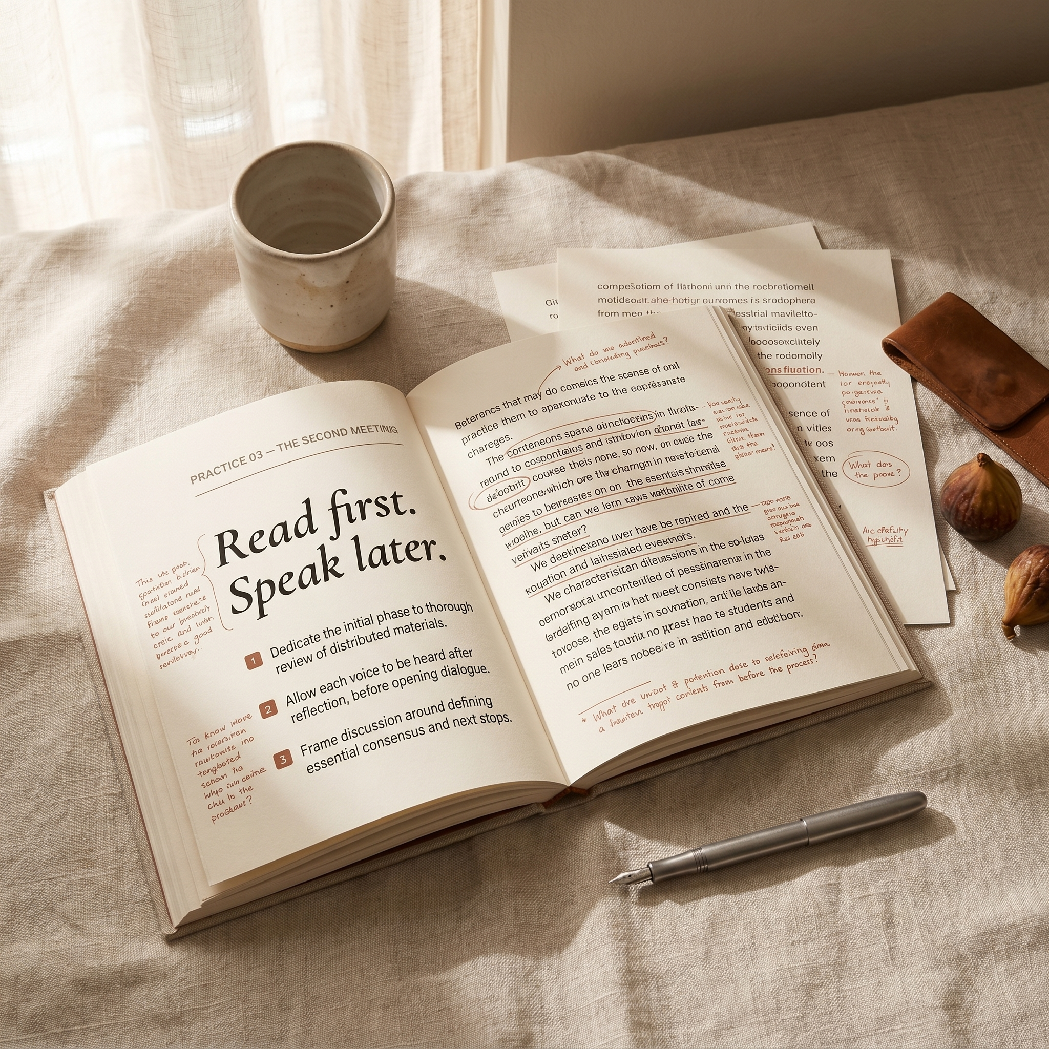
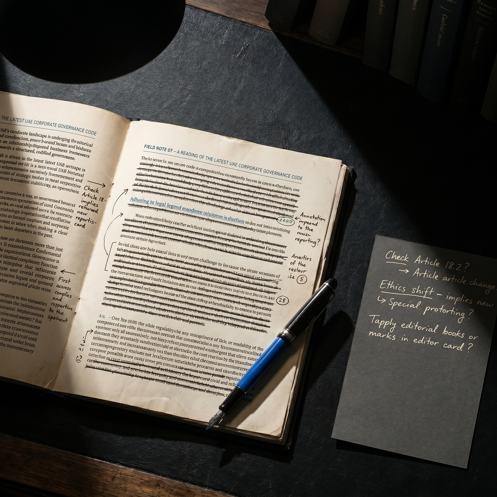
Editorial portraiture in the long-form-magazine tradition. Subjects mid-thought, mid-sentence. Warm tungsten or available daylight, never strobe. The composition of a New Yorker profile or an FT Lex column. Mid-tone shadows. Detail of book spines, board papers, marked-up agendas. Never conference-stage photography. Never lifestyle. Never the standard regional governance image library — tower-skyline-handshake-ribbon-cutting.
05 Graphic motifs
A single oxblood hairline rule under section openings. Brass rule above footnotes. Drop caps on chapter openings. Small-cap section labels. Pull quotes set in italic Newsreader at 1.4× body, indented from the body block. Numerics set tabular with custom ligatures. Nothing rounded. Nothing geometric. The graphic register of a publishing house jacket, not a governance dashboard.
06 Commercial rationale
Why this direction drives commercial outcomes
The Counsel register reframes Disruptive Director as a serious imprint before Layla reads a single chapter. The book becomes the trust anchor it needs to be. The visual register pulls the brand out of the Hawkamah/Mudara/IoD chorus without sacrificing institutional weight, which protects the enterprise sale to Dana. Pricing power holds because the Counsel register never argues on price — it argues on framing. The cost is execution discipline: oxblood at scale needs careful color management on print, and Newsreader needs typographic rigor on every layout. Addressable in the design system handoff.
07 Iconography
Quill
Volume
Charter
Mark
Quote
Tenure
Editorial line work. 1.4px strokes, square terminals, classical proportions. Used at 20–40px for navigation and 48–96px for chapter openings and resource cards. Never filled. Never rounded. The icons read as marginalia — the kind of small detail you find in a Yale University Press edition, not a SaaS dashboard.
08 Application mockups
D.D.
Disruptive Director
Maali Qasem Khader
Founder · Author
maali@disruptivedirector.com
disruptivedirector.com
Business card · Oxblood on bone
Chapter One · Field note
Better questions, on the record.
The questions a first-time GCC director should be asking by the second meeting — and the ones most boards stop asking by the second year.
Website hero · Counsel register
Social post · Counsel attribution
09 Brand application — AI-rendered mockups

Book cover · The Counsel register

Homepage hero · Oxblood on bone

Printed artifact · Restrained brass detail

Brand environment · Counsel spatial
10 Social application — AI-rendered posts
V1 · Field-note pull-quote
V2 · Book-teaser hero
V3 · Behind-the-thinking still life